The Art Of Creating An Inviting Exhibition Stand Design
Visitors stop at displays that catch their eye. Busy floors full of booths require clear ideas to grab interest instantly. Colors and layout work together to pull a crowd close. Good choices keep folks curious while bad ones push them away quickly.
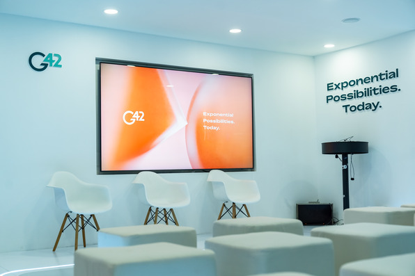
Every detail matters when building a space meant to stop a crowd and showcase a perfect exhibition stand design.
Lighting sets the mood
Bright spaces draw people in like moths to a flame. Soft glows create comfort. Harsh beams irritate eyes. Use varied spots to highlight items. Shadows add depth while warm light adds a soft touch. Keep glare away from sensitive items. Proper illumination keeps the area warm. Focus light on key pieces to draw focus where needed.
Open space creates flow
Crowds move where paths exist. Keep floors clear to let folks walk freely. A blocked path stops traffic. Leave room for standing and talking. Small booths look bigger with open sides. Wide paths encourage entry. Cluttered zones push folks away. Clear lines lead guests toward the center. Let air flow to keep the atmosphere fresh.
Colors influence mood
Red grabs attention quickly. Blue calms the mind. Green feels fresh. Pick hues that fit the goal. Use bold shades to pop. Use muted tones for calm areas. Consistent color schemes look clean. Bright walls wake up a dull room. Dark colors add weight. Pick two main colors and stick to them. Avoid too many clashing shades.
Furniture choices matter
Hard chairs keep stays short. Soft seats encourage chats. Select items that fit the room size. Tall tables allow quick talks. Low chairs permit long stays. Pick pieces that serve a function. Every item should have a purpose. Avoid bulky gear that wastes space. Keep decor light and simple. Use stools to save room.
Graphics speak loud
Large print works best. Simple fonts remain readable from afar. Words should be few and clear. Images show what words cannot. Keep text at eye level. Avoid tiny details that force people to squint. Clear logos help folks learn the name fast. Keep the message short. Use high quality prints. Blurred text ruins the look.
Props add interest
Items that move capture gazes. Displays with motion win fans. Tools that invite touch work well. Keep props safe from damage. Items should relate to the core message. Too many items confuse a guest. Pick three key props to display. Change items daily to keep things fresh. Keep items clean. Dust kills the look fast.